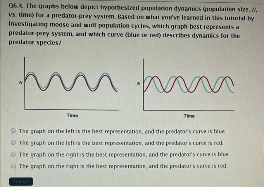
The graphs below depict hypothesized population dynamics (population size, N vs. ?time) ?for a predator -prey system. Based on what you’ve learned in this tutorial by investigating moose and wolf population cycles, which graph best represents a predator -prey system , ?and which curve ( ?blue or red) ?describes dynamics for the predator species?
The graph on the left is the best representation, and the predator’s curve is blue. The graph on the left is the best representation, and the predator’s curve is red. The graph on the right is the best representation, and the predator’s curve is blue. The graph on the right is the best representation, and the predator’s curve is red.
The Correct Answer and Explanation is :
The correct answer is:
The graph on the left is the best representation, and the predator’s curve is red.
Explanation:
In a predator-prey system, population dynamics typically follow a cyclical pattern, as demonstrated by the famous Lotka-Volterra predator-prey model. The graph on the left accurately reflects the hypothesized population dynamics for such systems. Here’s why:
- Lagged Population Dynamics:
Predator and prey populations are interconnected, but their dynamics are not perfectly synchronized. Prey populations typically increase first due to lower predator pressure. As prey populations grow, predators have more food, leading to an increase in predator numbers. However, the increase in predators eventually causes a decline in prey numbers. The predator population subsequently declines due to reduced prey availability. This lagged interaction creates the cyclical pattern depicted in the left graph. - Predator Curve (Red):
The predator population (red curve) typically peaks after the prey population (blue curve). This is because predators depend on prey for sustenance, so their population growth lags behind the prey population. The red curve aligns with this pattern in the left graph, peaking slightly after the blue curve. - The Right Graph:
The graph on the right shows no clear lag between the two curves, which is inconsistent with known predator-prey dynamics. It might suggest an unrealistic or simplified relationship that doesn’t account for delayed responses in predator populations. - Empirical Evidence:
Research on systems like the Isle Royale moose and wolf populations supports this pattern. Moose populations (prey) grow when wolf populations (predators) are low, and wolf populations peak after moose numbers rise, reflecting the cyclical predator-prey relationship seen in the left graph.
Thus, the left graph best represents the predator-prey system, and the predator’s curve is the red one.