Kohelis Mining is a monopoly and is currently operating at a loss.
(a) Draw a correctly labeled graph and show each of the following.
(i) The profit-maximizing quantity, labeled QM (ii) The profit-maximizing price, labeled PM
(iii) The average total cost curve, labeled ATC (iv) The allocative efficient quantity, labeled QA
The correct answer and explanation is :
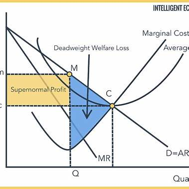
In the context of Kohelis Mining, a monopolistic firm operating at a loss, we can illustrate the following concepts on a graph:
(i) Profit-Maximizing Quantity (QM):
The profit-maximizing quantity occurs where the Marginal Revenue (MR) curve intersects the Marginal Cost (MC) curve. At this output level, the firm maximizes its profit (or minimizes its loss).
(ii) Profit-Maximizing Price (PM):
The profit-maximizing price is determined by extending a vertical line from QM to the Demand (D) curve. The price corresponding to this quantity on the demand curve is PM.
(iii) Average Total Cost Curve (ATC):
The ATC curve represents the per-unit cost of production at each output level. In this scenario, the ATC curve lies above the Demand curve at QM, indicating that the firm is incurring losses, as the price (PM) is less than the average total cost per unit.
(iv) Allocatively Efficient Quantity (QA):
Allocative efficiency occurs when the price equals the marginal cost (P = MC). At this point, the value consumers place on the last unit produced (reflected by the price) equals the cost of producing that unit. QA is found where the Demand curve intersects the MC curve. If QA is greater than QM, it suggests that Kohelis Mining is producing less than the socially optimal quantity, contributing to a deadweight loss.
Explanation:
In a monopolistic market, the firm faces a downward-sloping demand curve, meaning it must lower the price to sell additional units. To maximize profit, the monopolist produces at the quantity where MR = MC. However, this output level is typically less than the allocatively efficient quantity, where P = MC. The area between the demand and MC curves, from QM to QA, represents the deadweight loss, indicating lost welfare to society due to reduced output and higher prices compared to a perfectly competitive market.
In this graph:
- The downward-sloping line represents the Demand curve.
- The upward-sloping line represents the Marginal Cost (MC) curve.
- The Marginal Revenue (MR) curve lies below the Demand curve.
- The Average Total Cost (ATC) curve is U-shaped and lies above the MC curve.
- QM is the quantity where MR equals MC.
- PM is the price corresponding to QM on the Demand curve.
- QA is the quantity where the Demand curve intersects the MC curve, representing allocative efficiency.
This graphical representation aids in understanding the monopolist’s pricing and output decisions, as well as the resulting inefficiencies compared to a perfectly competitive market.