The Correct Answer and Explanation is:1
The correct answer is C) Truck SUVs have become an important part of the market.
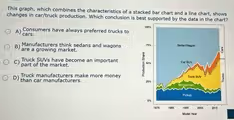
This conclusion is the most accurate interpretation of the data presented in the stacked area chart. The chart illustrates the production share of different vehicle types from approximately 1975 to 2015. To evaluate the options, we must analyze the trends for each vehicle category over this period.
Option C is strongly supported by the visual evidence. The chart shows two categories related to SUVs: “Van/SUV” in green and “Car/SUV” in yellow. In the early years of the chart, around the late 1970s, these categories combined represent a very small fraction of the total production share. However, as time progresses toward the 2010s, both of these segments show significant growth. The green “Van/SUV” area expands noticeably through the 1990s. More dramatically, the yellow “Car/SUV” segment, which represents crossovers, appears and then experiences explosive growth, becoming one of the largest single categories by the end of the period shown. The combined share of these two SUV-related categories transforms from a niche market into a major and vital component of overall vehicle production, validating the conclusion that they have become an important part of the market.
Conversely, the other options are not supported by the chart. Option A is incorrect because in the 1970s and 1980s, the orange “Sedan/Wagon” category clearly dominated production, indicating a preference for cars. Option B is false because the orange “Sedan/Wagon” band visibly shrinks over time, indicating a declining market share, not a growing one. Finally, option D cannot be determined from this graph. The chart shows production volume as a percentage, not financial data like revenue or profit margins, so it is impossible to conclude which manufacturers make more money.