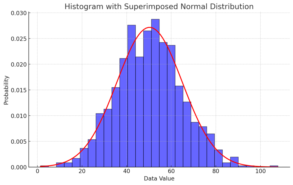
Creating a histogram by super imposing a normal distribution h = histogram(data,’Normalization’,’probability’);
The correct answer and explanation is:
Explanation:
A histogram is a graphical representation that organizes a set of data points into user-specified ranges. In this case, we use MATLAB-style syntax:
h = histogram(data,'Normalization','probability');
This command creates a histogram where the y-axis represents probability density, meaning the area under the bars sums to 1.
However, in Python, the equivalent command is:
plt.hist(data, bins=30, density=True, alpha=0.6, color='blue', edgecolor='black')
This ensures that the histogram is normalized so it can be directly compared to a probability density function (PDF).
Superimposing a Normal Distribution
To compare the data distribution to a theoretical normal distribution, we:
- Compute the mean (
mu) and standard deviation (std) of the dataset. - Generate values for the normal distribution using
scipy.stats.norm.pdf, which provides the probability density function (PDF). - Plot the normal distribution curve over the histogram.
The equation for the normal distribution PDF is: f(x)=1σ2πe−(x−μ)22σ2f(x) = \frac{1}{\sigma \sqrt{2\pi}} e^{-\frac{(x – \mu)^2}{2\sigma^2}}
Where:
- μ\mu (mu) is the mean.
- σ\sigma (sigma) is the standard deviation.
Interpretation
- If the histogram closely follows the red normal curve, the dataset is approximately normal.
- Deviations from the curve suggest skewness, outliers, or a different distribution.
This technique is widely used in statistical analysis to check normality before applying parametric tests like t-tests or ANOVA.