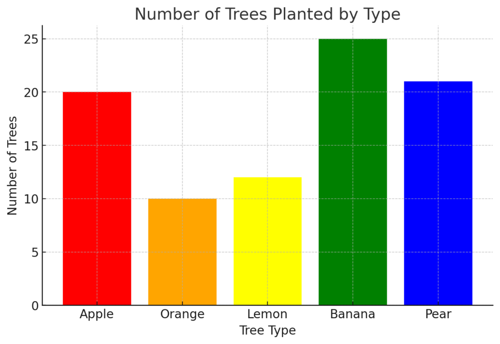
Tree type Apple Orange Lemon Banana Pear
_____________________________________________________________
Number of tree 20 10 12 25 21
________________________________________________________________
A farmer grows apples, oranges, lemons, bananas, and pear trees. The Number of trees planted this year is shown in the table. Which of the following would best display the data?
Line graph C. Bar graph
Scatter plot D. Stem and leaf plot
The correct answer and explanation is:
The best way to display the given data is a Bar Graph (C).
Explanation:
A bar graph is the most effective way to represent the number of trees planted because it clearly compares different categories—apple, orange, lemon, banana, and pear trees—using bars of varying heights. Each tree type is a separate category, and a bar graph provides a visual comparison of the number of trees in each category.
Why a Bar Graph?
- Categorical Data Representation: The tree types are distinct categories (not continuous data), making a bar graph an ideal choice.
- Easy Comparison: A bar graph allows viewers to quickly see which tree type has the highest and lowest numbers.
- Clear Visualization: Each bar represents a different tree type, making it simple to interpret the data at a glance.
- Accurate Measurement: Since the heights of the bars correspond to the number of trees, one can easily determine the values.
Why Not the Other Graphs?
- Line Graph: Line graphs are used for showing trends over time. Since this dataset is not based on time, a line graph would not be suitable.
- Scatter Plot: Scatter plots are used for showing relationships between two numerical variables, but this data consists of one numerical variable (number of trees) and one categorical variable (tree type), so a scatter plot is not appropriate.
- Stem and Leaf Plot: This type of plot is best for organizing individual numerical values, but it is not effective for comparing categories.
Thus, the most suitable graph for this data is a bar graph.
Now, let’s generate an image of the bar graph.
Here is the bar graph representing the number of trees planted for each tree type. The different colors make it easy to compare the number of Apple, Orange, Lemon, Banana, and Pear trees. This visualization effectively conveys the data and allows for quick interpretation. Let me know if you need any modifications!