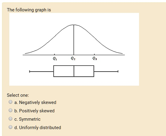
The following graph is Select one: Negatively skewed b. Positively skewed Symmetric Uniformly distributed
The Correct Answer and Explanation is:
Correct Answer: c. Symmetric
Explanation
The graph presented shows a bell-shaped curve along with a boxplot that aligns with the characteristics of a symmetric distribution. This is indicative of a normal distribution, which is one of the most common examples of a symmetric distribution.
In the diagram:
- The bell-shaped curve is centered at Q2Q_2, which represents the median.
- Q1Q_1 (the first quartile), Q2Q_2 (the median), and Q3Q_3 (the third quartile) are equally spaced.
- The boxplot underneath the curve shows the median line exactly in the center of the box, and the whiskers on both sides of the box are of equal length.
All these features are characteristic of a symmetric distribution, where the data is evenly distributed around the center. This implies that the left side of the distribution is a mirror image of the right side.
In contrast:
- A negatively skewed (left-skewed) distribution would show a longer tail on the left side, with the median closer to the upper quartile.
- A positively skewed (right-skewed) distribution would have a longer tail on the right, with the median closer to the lower quartile.
- A uniform distribution would not show a bell shape or central tendency like this; instead, all outcomes would appear equally likely, often depicted as a flat horizontal line.
This diagram, with its symmetric shape and centered median, clearly represents a symmetric distribution, most closely resembling the normal distribution where mean = median = mode. It is important in statistics because many natural phenomena and statistical methods are based on the assumption of normality or symmetry in the data.
Thus, the most accurate interpretation is:
Answer: c. Symmetric.
