The Correct Answer and Explanation is:
The correct answer is Graph A.
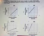
This problem requires identifying the graph that correctly illustrates a proportional relationship. The recipe specifies a constant rate: 1.5 cups of flour for every 1 ounce of butter. To find the correct graph, we must analyze this relationship and see which graph visually represents it.
First, we establish the variables. The amount of butter is the independent variable, which is plotted on the horizontal x-axis. The amount of flour is the dependent variable, as it changes based on the amount of butter, and is plotted on the vertical y-axis. The relationship can be described by the linear equation y = 1.5x, where y represents the cups of flour and x represents the ounces of butter.
A key feature of this recipe is that if you use zero ounces of butter, you will also use zero cups of flour. This means the graph must start at the origin, the point (0, 0). All four graphs shown satisfy this condition.
The next step is to check the specific points on each line to see if they match the recipe’s ratio. We can test a few values for the amount of butter.
If we use 2 ounces of butter (x = 2), the amount of flour should be 1.5 * 2 = 3 cups (y = 3). We need to find the graph that passes through the point (2, 3).
If we use 4 ounces of butter (x = 4), the amount of flour should be 1.5 * 4 = 6 cups (y = 6). The correct graph must also pass through the point (4, 6).
Let’s examine Graph A. If we locate 2 on the x-axis and move up to the line, the corresponding value on the y-axis is 3. If we locate 4 on the x-axis, the y-axis value is 6. This perfectly matches the recipe’s requirements. The other graphs show incorrect ratios. Graph B shows a ratio of 2 cups of flour per ounce of butter, Graph C shows 0.5 cups, and Graph D shows 2.5 cups. Therefore, Graph A is the only one that accurately depicts the relationship.