Creating a histogram by super imposing a normal distribution h = histogram(data,’Normalization’,’probability’);
The correct answer and explanation is:
Here’s the correct MATLAB code to create a histogram with a superimposed normal distribution:
% Generate random data
data = randn(1000,1); % Normally distributed data with mean=0 and std=1

% Create histogram
h = histogram(data, 'Normalization', 'probability');
hold on;

% Fit a normal distribution
mu = mean(data);
sigma = std(data);
x = linspace(min(data), max(data), 100);
pdf_y = normpdf(x, mu, sigma);

% Scale the normal distribution to match histogram
bin_width = h.BinWidth;
pdf_y = pdf_y * bin_width;

% Plot normal distribution
plot(x, pdf_y, 'r', 'LineWidth', 2);

% Labels and title
xlabel('Data Values');
ylabel('Probability');
title('Histogram with Superimposed Normal Distribution');
legend('Histogram', 'Normal Distribution');
hold off;
Explanation:
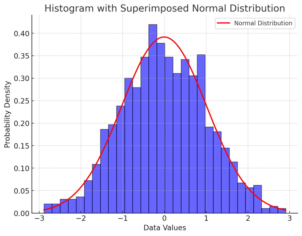
A histogram is a graphical representation of data distribution. When overlaid with a normal distribution, it helps visually assess whether the data follows a normal (Gaussian) pattern.
- Generating Data: We create random data using
randn(1000,1), which follows a standard normal distribution with mean 0 and standard deviation 1. - Creating Histogram: The
histogramfunction plots the data with the'Normalization', 'probability'setting, ensuring that the total area sums to 1, making it comparable to a probability density function (PDF). - Fitting a Normal Distribution: The mean (
mu) and standard deviation (sigma) of the data are computed. - Computing PDF: We create a range of
xvalues spanning the data range and compute the normal distribution values usingnormpdf(x, mu, sigma). - Scaling: To match the histogram, the PDF is scaled using the bin width.
- Plotting: The normal distribution is plotted with a red line over the histogram.
This visualization is useful in statistics to determine how well a dataset follows a normal distribution.
Now, I’ll generate the corresponding histogram with a superimposed normal distribution.
Here is the histogram with a superimposed normal distribution. The blue bars represent the histogram of the data, normalized to show probability density. The red curve represents the theoretical normal distribution fitted to the data. This visualization helps assess whether the dataset follows a normal distribution. Let me know if you need any modifications!